Design system

Every block
the site is built from

Tokens, atoms, blocks and their variants, rendered from the live components. Sub-pages are composed from these pieces only. Class names and source files are listed with each block.

FoundationsWhat everything else is measured in

Color tokens

Two page surfaces only, black and near-black. Text in three steps. One border color at 5% white. Green is reserved for live indicators, the accent quote and the Countly UI.

:root { --bg … }styles.cssdark (default)light (parked)
--bg
--bg-alt
--bg-2
--fg
--fg-2
--muted
--line
--green
--green-hi
violet#593A92 · Enterprise tile
light#f4f4f2 · Flex tile
accent#12af51 · quote card

Type scale

Headline face is Switzer Regular, set as the --display default in CSS and applied on every route, modals included; the review panel can swap it for a comparison. Body is Switzer, mono is Geist Mono. Sizes are fluid clamps; the panel scale and leading multiply the display sizes.

.display, .display--xl/--lg/--md/--sm, .h1, .h2, .h3, .lead, body, .monostyles.css

Display XL

Display LG

Display MD

Display SM

Heading 1 · section titles

Heading 2

Heading 3 · card titles

Lead · supporting paragraph next to a section title, max 40em.

Body · 15px Switzer, muted for descriptions.

MONO · labels, specs, numbers 01-04

Text atoms

Small text elements that structure a block. Eyebrow with dot is used once, in the hero; plain eyebrow everywhere else.

.eyebrow, .eyebrow--plain, .pill, .mono label, .menu__tagstyles.csseyebrow with doteyebrow plainpilltag

Product intelligence

Section label

Introducing Countly 27 New

Buttons and links

Pill buttons, 42px. Primary is white on dark. Ghost is outlined. Dark is used on the CTA band. Small is the nav variant. Arrow links are the standard 'read more'.

.btn, .btn--ghost, .btn--dark, .btn--sm, .btn--wide, .link, .link--arrowstyles.cssprimaryghostdarksmwidelinklink--arrow

Section measures

Three reading widths beside the full 1280px grid. Narrow stacks the header above the content and pulls the whole block (grids, steps, screenshots, pills, mechanism rows) onto one measure. Why Countly’s Compared block uses 880px; solution pages use 1080px; the FAQ has its own 760px column, used on pricing, Enterprise and architecture.

.sec--narrow (--measure: 880px), .sec--mid (1080px), .faq--narrow (760px)styles.css; more.tsx · SolutionPage; platform.tsx · Faq880 · compared1080 · solutions760 · faq
1280full grid
1080solutions · sec--mid
880compared · sec--narrow
760faq--narrow

Visuals and motionGrounds, drawings, diagrams and the things that move

Textures and screenshots · Shot

Every product image sits whole on a generated texture. No CSS filters on animated layers (Chrome drops tiles), no blend modes, square outer frame, 12px radius only on the UI screenshot itself. Mode, palette and waves come from the review panel.

.shot, .shot--tex/.mesh/.waves/.photo/.solid, .shot--fit, .shot__ui--img, .tex--spectral/aurora/iris/ember/graphite/monosections.tsx · Shottexturemeshwavesphotosolidwith UItexture only

Blog thumbnails

Blog cards need an image and the posts have no photographs; stock photography of people pointing at laptops would say nothing true about them. Each card gets one of the texture palettes instead, picked from the words in the post's own slug (compliance reads graphite, releases aurora, analytics practice iris, comparisons spectral, AI ember) with the hairline grid over it and the same grain the screenshots carry. No files, no requests, and it holds still: a dozen drifting gradients on an index page is a cost the page cannot justify.

.postart, .postart__tex/__grid/__grain, .pp__rel--artsections.tsx · PostArt, postTexgraphite · complianceaurora · releasesiris · practicespectral · comparisonsember · AI

Isometric figures · Fig

Three hairline drawings on a 30° isometric, generated rather than drawn: an isolated stack of plates, a stream of cubes into the store, blocks on one base plate. Faces are filled with the page surfaces so the strokes read as one wireframe object. Static. They carry the three Data ownership pillars on the homepage.

.fig, .f, .f--t/.f--l/.f--r, .f--dash, .l, .l--seam, .l--dash, .rpfigures.tsx · Fig, FIGS01 isolated02 stream03 one plate
01 isolated
02 stream
03 one plate

Penrose figure · PuzzleFig

Thirteen cubes along three axes that close into an impossible triangle, because on screen the last cube lands exactly where the first one starts. Six takes on the one object, sharing a renderer: each cube arrives with a rotation, a translation and a scale about its own center, faces culled by signed area and shaded by their rotated normal. All six stop when off screen and under reduced motion; together they cost 3.9KB gzipped. Features runs build, architecture runs assemble, and the review panel can preview any of them everywhere.

.fig--puzzle, .f, pzDraw, PzRigfigures.tsx · PuzzleFig, PuzzleAssemble, PuzzleTurn, PuzzleExplode, PuzzleBuild, PuzzleSuite, PuzzleMirrorassembleturnexplodebuildsuite (30s)mirror
assemble
turn
explode
build
suite · 30s
mirror

Bands · DataBand

Horizontal marquees, transform-only, masked at the edges, paused for reduced motion. Five variants for different jobs: the dense event stream under Platform, a single quiet line as a divider, two rows for rhythm, feature pills for 'everything included', and a logo band as an alternative to the logo grid.

.band, .band--line, .band--dual, .band--pills, .band--logos, .band--glow-white/green, .pillx--glow, DataBand({ variant, items, speed, rows, glow })App.tsx · DataBand, STREAM, FEATURES_ALLstream (6 rows)linedualpills · rows 1-6pills · glow white / greenpills · ring / ring-greenlogos

stream

line

dual

pills · 2 rows

pills · 4 rows · white glow (pills light up)

pills · 3 rows · green glow

pills · 3 rows · ring (a shiny border sweeps around random pills)

pills · 2 rows · green ring

logos

Pills · PillCloud

Static, wrapping feature pills, the non-moving sibling of the pill band. Use it to list everything a plan or a layer includes; highlight a subset with `active`.

.pillcloud, .pillcloud__label, .pillx, .pillx.is-on, .pillx--glow, PillCloud({ items, label, active, glow })App.tsx · PillCloud, FEATURES_ALLall featuressubset with labelhighlightedglow white / greenring / ring-green
All 50+ features
Data ManagerEvent schemaTransformationsMaskingHashingConsent managementPII handlingData qualityRetention rulesRegional residencyAir-gapped deploymentExport APIAudit logsSessionsUsersEventsViewsSourcesDrillFunnelsRetentionCohortsFlowsJourneysFormulasCrashesPerformance monitoringDashboardsAlertsEmail reportsUser profilesPush notificationsIn-app messagesA/B testingAdaptive VariablesFeature rolloutsSurveysNPSRatingsWebhooksHooksSegmentationLocalizationCee AI agentNatural language queriesFindingsAnomaly detectionContext for your AI through MCPMCPiOS SDKAndroid SDKWeb SDKReact Native SDKFlutter SDKUnity SDKNode.js SDKJava SDKWindows SDKC++ SDKHarmonyOS SDKREST APIPluginsSSO / SAMLRoles and permissions
Engagement
Push notificationsIn-app messagesA/B testingAdaptive VariablesFeature rolloutsSurveysNPSRatingsWebhooksHooksSegmentationLocalizationCee AI agent
Green glow · pills light up over time
Data ManagerEvent schemaTransformationsMaskingHashingConsent managementPII handlingData qualityRetention rulesRegional residencyAir-gapped deploymentExport APIAudit logsSessionsUsersEventsViewsSourcesDrillFunnelsRetentionCohortsFlowsJourneysFormulasCrashesPerformance monitoringDashboardsAlertsEmail reportsUser profilesPush notificationsIn-app messagesA/B testingAdaptive VariablesFeature rolloutsSurveysNPSRatingsWebhooksHooksSegmentationLocalizationCee AI agentNatural language queriesFindingsAnomaly detectionContext for your AI through MCPMCPiOS SDKAndroid SDKWeb SDKReact Native SDKFlutter SDKUnity SDKNode.js SDKJava SDKWindows SDKC++ SDKHarmonyOS SDKREST APIPluginsSSO / SAMLRoles and permissions
Ring · a shiny border travels around random pills
Data ManagerEvent schemaTransformationsMaskingHashingConsent managementPII handlingData qualityRetention rulesRegional residencyAir-gapped deploymentExport APIAudit logsSessionsUsersEventsViewsSourcesDrillFunnelsRetentionCohortsFlowsJourneysFormulasCrashesPerformance monitoringDashboardsAlertsEmail reportsUser profilesPush notificationsIn-app messagesA/B testingAdaptive VariablesFeature rolloutsSurveysNPSRatingsWebhooksHooksSegmentationLocalizationCee AI agentNatural language queriesFindingsAnomaly detectionContext for your AI through MCPMCPiOS SDKAndroid SDKWeb SDKReact Native SDKFlutter SDKUnity SDKNode.js SDKJava SDKWindows SDKC++ SDKHarmonyOS SDKREST APIPluginsSSO / SAMLRoles and permissions

Cee mark · Cee

The AI agent's face, identical to the product: same paths, same blink (5.2s) and grin (7.4s) timings, optional idle bob. Bare face in currentColor on our surfaces is the default; the green disc is the product's own mark and the only round element on the site. Kept in the system for later; currently not placed on any page.

.cee (badge) · .cee-bare · .cee-float · Cee({ size, variant, float })sections.tsx · Ceebare · 56-72pxbare + floatbadge (product mark)

Customer logos

Eight logos across the full width. Below the hero image with the sentence about 2,000 teams, or above the image (compact, no sentence). Missing logos render as text until the file arrives.

.customers, .customers--top, .customers__row (8 columns), .logo-img, .logo-img--text, LogoRowsections.tsx · Customers, Logos, LogoRowbelow image + sentenceabove image (compact)LogoRow (pricing, sub-pages)

Trusted by 17,000+ apps in 126 countries, from regulated enterprises to fast-moving startups.

AWSBMW GroupVerizonSchneider ElectricCoca-ColaStandard CharteredSAPAllianzElsevierRaiffeisen BankTelekom

LabMore of the same, under review and not placed yet

Logo beam

The argument holds still on the left while the proof runs past it. A logo wall says these companies; a beam says and it keeps going. Masked at both edges, one pass of the list duplicated so the loop has no seam, and it stops when it is off screen. In use as the trust strip on /pricing.

.beam, .beam__copy, .beam__track, .beam__runsections.tsx · LogoBeamlabel + lineany list of marks

Trusted by

17,000+ apps in 126 countries keep their data at home.

AWSBMW GroupVerizonSchneider ElectricCoca-ColaStandard CharteredSAPAllianzElsevierRaiffeisen BankTelekom

Lab · Veil

A boundary you can watch data cross. The blur is a band the content passes under rather than a filter on the content, and that one mechanism carries two opposite arguments: mask blurs the middle, so what crosses the boundary goes unreadable; focus blurs everything but the middle, so you see the slice you are entitled to. Three content sets, because the same block has to work for a reader who thinks in identifiers, one who thinks in events, and one who reads code.

.veil, .veil--mask, .veil--focus, .veil__run, .veil__chip, .veil__band, .veil__side, .veil__caplab.tsx · Veil, VEIL_SETSmask · identifiersmask · eventsfocus · code
user_id 8f3a91c2email a.novak@…device iPhone 15ip 84.42.19.7city Praguesession 0x41f9user_id 8f3a91c2email a.novak@…device iPhone 15ip 84.42.19.7city Praguesession 0x41f9user_id 8f3a91c2email a.novak@…device iPhone 15ip 84.42.19.7city Praguesession 0x41f9
user_id 21b7ee40phone +420 6…ua Chrome 131lat 50.08lon 14.43account 4471user_id 21b7ee40phone +420 6…ua Chrome 131lat 50.08lon 14.43account 4471user_id 21b7ee40phone +420 6…ua Chrome 131lat 50.08lon 14.43account 4471
user_id c0ffee12email j.dvorak@…device Pixel 9ip 91.19.4.220city Brnosession 0x77c1user_id c0ffee12email j.dvorak@…device Pixel 9ip 91.19.4.220city Brnosession 0x77c1user_id c0ffee12email j.dvorak@…device Pixel 9ip 91.19.4.220city Brnosession 0x77c1
checkout_donevalue 149.00plan enterprisecart_addview_pricingsignupcheckout_donevalue 149.00plan enterprisecart_addview_pricingsignupcheckout_donevalue 149.00plan enterprisecart_addview_pricingsignup
session_startpush_openedsurvey_shownapp_crashtrial_startedinvite_sentsession_startpush_openedsurvey_shownapp_crashtrial_startedinvite_sentsession_startpush_openedsurvey_shownapp_crashtrial_startedinvite_sent
feature_usedexport_failedloginseat_addedquery_rundashboard_savedfeature_usedexport_failedloginseat_addedquery_rundashboard_savedfeature_usedexport_failedloginseat_addedquery_rundashboard_saved
Countly.q.push(["add_event",{key: "checkout_done"count: 1sum: 149.0}])await countly.flush()Countly.q.push(["add_event",{key: "checkout_done"count: 1sum: 149.0}])await countly.flush()Countly.q.push(["add_event",{key: "checkout_done"count: 1sum: 149.0}])await countly.flush()
consent: ["sessions","events"]device_id: hash(uid)require_consent: truesalt: env.SALTapp_key: •••url: https://…consent: ["sessions","events"]device_id: hash(uid)require_consent: truesalt: env.SALTapp_key: •••url: https://…consent: ["sessions","events"]device_id: hash(uid)require_consent: truesalt: env.SALTapp_key: •••url: https://…
SELECT count() FROM eventsWHERE key = 'signup'AND ts > now() - 7dGROUP BY countryORDER BY 1 DESCLIMIT 10SELECT count() FROM eventsWHERE key = 'signup'AND ts > now() - 7dGROUP BY countryORDER BY 1 DESCLIMIT 10SELECT count() FROM eventsWHERE key = 'signup'AND ts > now() - 7dGROUP BY countryORDER BY 1 DESCLIMIT 10

Lab · Pixelated ground

The ground a product screenshot stands on, resolved down to blocks while the screenshot itself stays sharp: drawn on a canvas at a fraction of the size and blown back up with smoothing off, so the blocks are real samples rather than a filter over the top. It takes both grounds the site uses. The photographs are sampled directly; the gradient textures are CSS and were never images, so they are redrawn on the canvas from the same values, which is the only way to sample them at all.

.pixshot, .pixshot__stage, .pixshot__cv, .pixshot__ui, .pixshot__ctllab.tsx · PixelShot, GROUNDSspectralauroraphotoblock 4-44pxoff
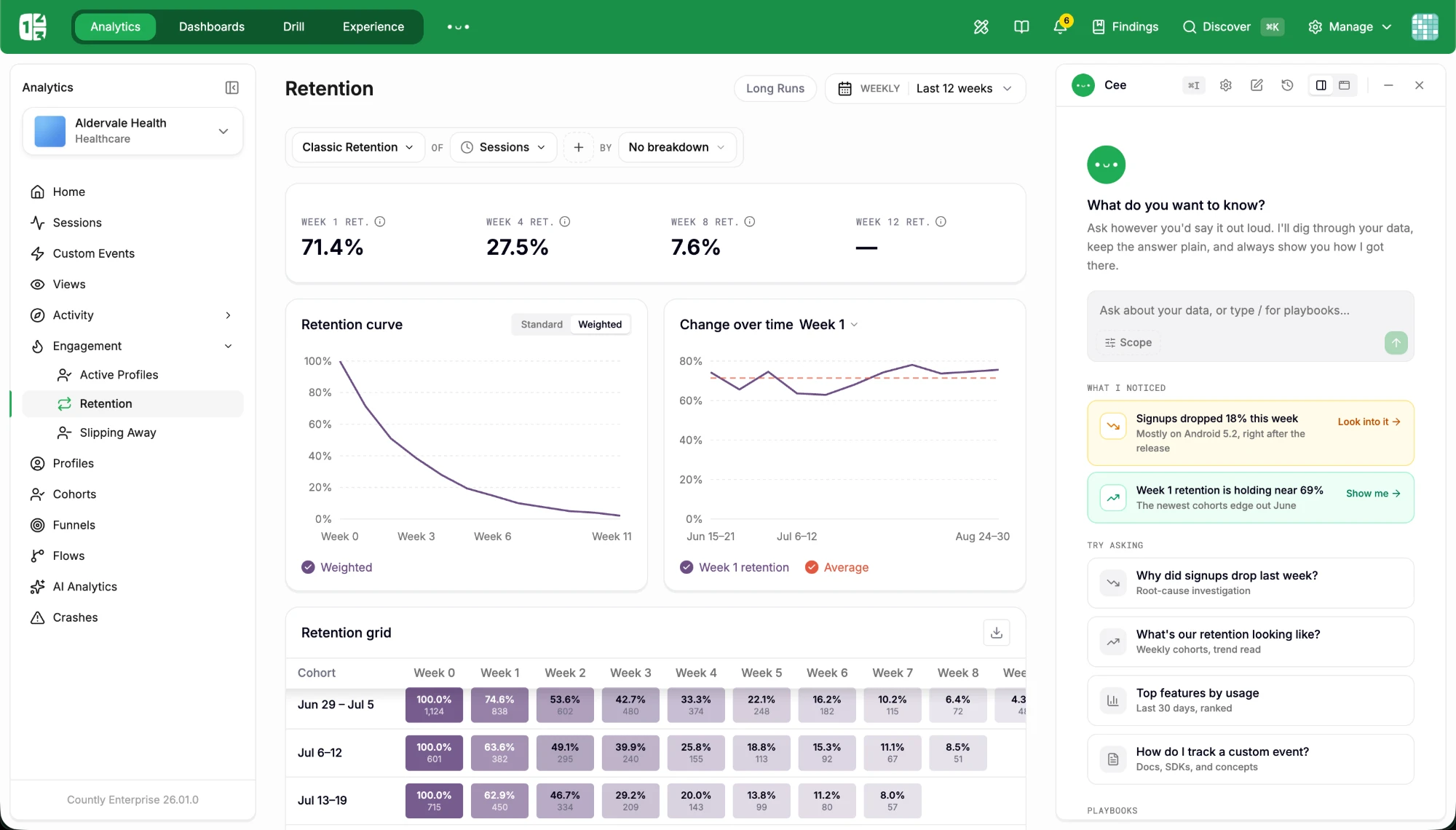
Countly product screenshot

Lab · Orb

620 points on a sphere. Fibonacci placement so they sit evenly however many there are, depth deciding size and brightness, painter's order back to front. The pointer does two things: points near it brighten and swell, and a drag throws the whole sphere, which then eases back to its idle drift. Canvas, no library.

.pf, .pf__cv, .pf__cv--grab, .pf__hint, useScenelab.tsx · Orbdrag to turnhover to light
drag to turn · hover to light

Lab · Field

A plane of points the pointer pushes aside, each on its own spring back to where it belongs, so the surface gives when you lean on it and returns when you leave. Pressing sends a ring out from the click that displaces whatever it passes. The grid rebuilds itself to whatever width it is given.

.pf, .pf__cv, useScenelab.tsx · Fieldpushpress for a ring
move to push · press to send a ring

Lab · Constellation

Drifting points that only join up where the pointer is: the link radius grows under the cursor, so the network forms in your hand and dissolves behind it. With no pointer on it there are no links at all, which is the point rather than a saving: connections exist where you are looking.

.pf, .pf__cv, useScenelab.tsx · Constellationidle · no linksunder the pointer
the network forms where you point

Lab · Counters

Figures that count up the first time they are read, and only then. Every claim on the site is a number, and this is the one motion that makes a number feel earned rather than typeset. Stepped on a timer rather than a frame loop, so it behaves the same in a background tab, and tabular figures so the digits do not jitter as they climb.

.cnt, .cnt__onelab.tsx · Counters, COUNTS
0+
apps on Countly
0
countries
0.0bn+
unique identities
0+
servers worldwide

Lab · Spotlight grid

A light that follows the cursor across the cells. One listener on the grid writes two custom properties and a single overlay reads them, so the cost is the same whether there are six cells or sixty: no per-cell listeners and nothing recalculated on the way.

.spot, .spot__cell, --mx, --my, --litlab.tsx · Spotlight
DrillAny question, on raw events
FunnelsWhere they stop, and who
RetentionWho comes back, and when
CohortsGroups that update themselves
FlowsThe route they actually took
CrashesSymbolicated, with the session

Lab · Layer stack

The four layers as planes on the isometric, drawn apart on hover so you can see there are four and that they rest on one another. The platform argument as a diagram rather than four columns of prose. Pure CSS transforms off one state, and it holds still under reduced motion.

.stk, .stk__scene, .stk__plane, .stk__taglab.tsx · LayerStack, STACKrestingseparated
L4 · AI
L3 · Engagement
L2 · Analytics
L1 · Data control
hover to separate

Lab · Draw on scroll

A line that draws itself as the block passes. The stroke length is tied to scroll position rather than to a timer, so it advances and rewinds with the reader instead of playing once and being over. The faint full path stays behind it, so the shape is legible before it is drawn.

.draw, .draw__ghost, .draw__inklab.tsx · DrawLine
drawn by the scroll · 0%

Cubes

The isometric engine with three things the flat figures did not have: cavities, so a block can have a hole in it and you see the inner walls; construction geometry: dashed planes, cages and plumb lines in world space; and contact shadows, which is the difference between a cube floating and a cube hovering. Six scenes, one claim each, and one rule holding all of them: the silhouette is a shape you can name before anything moves, and the gesture is the claim rather than decoration.

.fig--cube, cubes.tsx · draw(), plane(), cage(), line3()cubes.tsxisolatelayersqueryfunnelretentionalert
Isolate

Three tenants on three plinths. Yours is solid and stands on its own ground; the others are outlines. Nothing is shared, and the drawing has no way to share it.

Single tenant: Flex, pricing
Layers

Three slabs of one footprint, parting in order. The plumb lines hold the alignment: it is one stack, taken apart.

One data layer: architecture
Query

Each match leaves through the face it sits on, so nothing crosses the block, and the hole it left stays open behind it.

Ad-hoc on raw data: Drill
Funnel

Five columns of one height, standing apart. What survives each step is solid; what left is still there, in outline, above it.

Funnels, onboarding
Retention

The triangle itself: cohorts back, weeks across, the weight of a cell is what came back. Flat on purpose: the one scene here that is read rather than built.

Retention
Alert

A level skyline under a threshold plane. One column grows through it, and only the part above the line lights.

Alerts, crashes, anomalies
Hover turn

The Penrose figure holds until you touch it; a few degrees pull the three arms apart and the trick explains itself. On a touch screen it is simply the closed figure.

Anywhere the Penrose stands still
Creating your instance…
Loader

Three cubes, each lifting in turn. 44px, inline, no layout of its own.

Forms, takeovers, empty states
  • Runs in your own VPC
  • Every event kept, never sampled
  • Exported in one command
Bullet

One cube at text size. Hovering the row lifts it a step and a half; the lift is CSS.

Feature lists, spec sheets

Cubes · lit

One scene, and the only WebGL on the site. Everything else in the kit is a drawing (flat tones, a cull, a dashed line) and this exists for what a drawing cannot do: a real shadow, a surface that catches a light, a volume you can see into. It is a port of a published Three.js scene; its camera, its deck, its emissive core on a slow sine and its orbiting nodes are the author’s. Ours is the discipline: eight nodes on the inner radius and twelve on the outer, one size each, one speed each, evenly spaced, each turning its face to the middle, and a thread only where something is actually talking. Nothing in it is random. Three.js is code-split, so it only downloads on this page, and the scene idles when it scrolls out of view.

.scene, Stage, WebGLscene.tsx · Stage, buildCorebloomshadowspointer leantheme-aware
Loading the scene…

Move the pointer across it. Under reduced motion it renders one still frame and stops.

NavigationGetting around, and the panels that open from it

Get started chooser

Every Get started opens this panel under the button rather than a page. The only real decision is who operates the deployment. Two doors side by side at any width, each with an audience line and three proof ticks, and one link out to the comparison. Same shadow, animation and gray bar as the other nav panels; closes on Escape, on leaving the header, or on a pick.

.nav__gs, .gsd, .gsd__row, .gsd__tag, .gsd__lead, .gsd__ticks, .gsd__footApp.tsx · GetStartedMenu, DOORSself-hosted · Enterpriseprivate cloud · Flex

Page blocksThe sections pages are composed from

Feature list

Mono label on the left, three columns of short items with a plus sign. Used for SDKs, use cases and the full feature list on the Features page.

.feat, Features({ label, groups })sections.tsx · Features

Pillars · Ownership

Header plus three text pillars with a mono label, each above a 4:3 placeholder for a visual. Used once on the homepage.

.statement, .pillar, Placeholder 4:3sections.tsx · Ownership

00 · Data ownership

Keep your product
intelligence private.

Self-host Countly and your product data stays within the infrastructure you operate. In our private cloud, it lives in a dedicated environment, never pooled with anyone else’s.

01

Dedicated to you

A dedicated, isolated environment. No shared data layer, no mixing with other customers.

02

Real-time from the moment of capture

Events are queryable the instant they arrive. No batch window. No overnight job.

03

One system, one data layer

Collection, analysis, engagement, and AI operate on the same data, in one place.

Use-case switcher · Showcase

Hard-edged frame with four cells and one screenshot cell. Active cell = the other page surface; the divider line is the 7s timer track; auto-advances while on screen, pauses on hover; height is locked to the image. Beside-left, beside-right (flip) and above (row of four) variants. Header link goes to the platform page.

.show, .show--beside, .show--above, .show--flip, .show__body, .uc, .uc li.is-on, .uc__barsections.tsx · Showcase, PRACTICEbeside · cases leftbeside · cases right (flip)above · row of four

01 · Capture

All your product data,
in one place.

Mobile, web, backend, and internal data, unified at the source, validated as it arrives, and enriched into user profiles. One layer your analytics, engagement, and AI build on.

Explore data management

03 · Act

Turn insight into action,
without leaving Countly.

Spot a struggling user and respond while it still matters: an in-app message, an offer, or a workflow in your own tools. No export, no overnight batch.

Explore engagement features

Layers · Platform

Hairline-top columns: mono label, title, text, arrow link. Four columns for the platform layers, three for security controls.

.layers__grid, .layers__grid--3, .layerx, .layerx__moresections.tsx · Platform, LAYERS4 columns (L1-L4)3 columns (security)

Platform

Product intelligence,
as infrastructure.

Four layers, one system. Data enters through the control layer. Analytics, engagement, and AI above it work on the same live copy, with nothing to sync.

See all 50+ features
L1

Data Control Layer

Control what data is collected, how it’s stored, and who can access it. Mask sensitive fields, enforce access rules, transform data at ingestion, and maintain quality at the source.

Learn more
L2

Product Analytics

Understand how users behave across your product, in real time. Explore events, journeys, and outcomes without exporting or pre-aggregating data. Make decisions on live data, not delayed reports.

Learn more
L4

AI-Native Intelligence

Give your product and your AI direct access to structured, real-time behavioral data. Use it to power models, workflows, and decisions without moving data across systems. Built-in assistance like Cee helps explore and act on that data when needed.

Learn more

Edition tiles · Deployment

Two square tiles on a narrower 1120px grid: Flex light (#f4f4f2) and Enterprise violet (#593A92). Flex shows the price, Enterprise says Custom pricing. The same colors are used for the pricing page tiles.

.editions, .edition, .edition--light, .edition--violet, .tier, .tier--light, .tier--violetsections.tsx · Deployment, PricingPagelight · Flexviolet · Enterprise

Deployment

Choose how
you run Countly

Deploy on your own infrastructure, or start quickly in our private cloud. The platform remains the same.

See full pricing
Self-hosted

Countly Enterprise

Full control over how Countly runs. Deploy on your own infrastructure, in any environment that fits your requirements, and operate it under your own security and compliance model.

  • Deploy in your cloud, your data center or air-gapped
  • Analytics, Adaptivity and Intelligence, all included
  • No default vendor access to data
  • Dedicated CSM, onboarding and support
  • SLA included
Private cloud

Countly Flex

Get started without managing infrastructure. Run Countly in a dedicated private-cloud environment, with the same data control as Enterprise. Add Adaptivity and Intelligence when you need them.

  • Dedicated single-tenant instances
  • Your choice of Google Cloud region
  • 99.99% uptime SLA (add-on)
  • Managed backups & DR
  • SOC 2 Type II examined

Security controls · Trust

Header, four certification marks, then six controls in the layer language with a 20px line icon (lock, key, eye-off, user, globe, clock) instead of a label. Followed by the SDK feature list.

.certs, .cert, .layers__grid--3 .layerx--icon, .layerx__icon, Iconsections.tsx · Trust, CONTROLS, ICON

Security & compliance

Security by architecture.

Your data stays in a controlled, dedicated environment, built from the start for regulated teams. ISO 27001, 27017, and 27018 certified; SOC 2 Type II examined.

Explore data privacy
ISO 27001Certified
ISO 27017Certified
ISO 27018Certified
SOC 2Type II examined
TISAX®Participant*
GDPRCompliant by design
HIPAASupported · also COPPA, PDPL

*Countly Ltd. is a TISAX® Participant. TISAX® is a registered trademark of and governed by ENX Association. Learn more at enx.com/tisax

No default access

On Enterprise, Countly has no access to your data without your explicit permission. On Flex, access is limited, granted by you and logged.

Encryption everywhere

TLS in transit, encryption at rest, keys you can bring on self-hosted deployments.

Masking at ingestion

PII is masked, hashed or dropped before it is stored. Consent is enforced per feature.

Granular access control

Roles, per-app permissions, SSO and SAML, full audit logs of who saw what.

Residency you choose

Your choice of Google Cloud region on Flex. Anywhere, including air-gapped networks, on Enterprise.

Retention you define

Keep raw events as long as you need, purge on schedule, export on demand.

Integrations

Fits into your stack

SDKs and APIs designed to connect directly to your product, without adding another layer between your data and your systems.

SDK documentation

Quotes · Voices

One wide white card and one green card (#12af51), then three small quotes, then the Customer stories link. Square corners.

.quotes, .qcard, .qcard--accent, .qsmall, .powerssections.tsx · Voiceswhite widegreen accentsmall

Built for teams that don't compromise on data

“If you don’t collect the data of user behaviors, you won’t be able to tell how your users are using your system… and without that, I don’t know how you can have a product roadmap.”

“Customer feedback shaped our product for decades. Behavioral data didn’t replace that, but it completed the picture, allowing us to validate insights and make decisions with far more confidence.”

“What I love the most about Countly is the integration of data: the way the information from one feature ties into another and pulls from another. This gives us a complete, comprehensive view of customer behavior and product performance.”

Steps · Path

Four hairline columns with a mono step label, title and text. Used for the homepage path to value and 'How it works' on sub-pages.

.path, .path__steps, .path__nsections.tsx · Path, PATH; platform.tsx · Steps

Path to value

Go live in days,
not months

Whether you start with Flex or roll out Enterprise, Countly gives you a clear path from setup to value.

  1. 01

    Plan

    Choose the setup that fits your product, team, and deployment model. Start independently or define the architecture and rollout with our team.

  2. 02

    Connect

    Set up Countly, connect your data sources, and bring over what matters. Hands-on guidance is available when needed.

  3. 03

    Launch

    Instrument your product, validate data flow, and get key use cases live. Teams can move independently or work directly with our team to move faster.

  4. 04

    Grow

    Go live with confidence, then expand into engagement, personalization and AI. Our experienced team is here to help you get the most out of the system as you scale.

CTA band

Near full-viewport square band. The background is the same Shot as the hero and follows the panel's Background settings (no blur, no filters). Centered eyebrow, three-line display headline, two pills.

.cta, .cta__band, .cta__shot, .cta__in, .display--xlApp.tsx · CTA

Get started

Turn all your product data
into product intelligence.

FAQ

Native details/summary with a plus that rotates. Hairlines between items. Two layouts: the default 60/40 header with a full-width list (platform pages), and a narrow single column of 760px with the header stacked above it (pricing, Enterprise).

.faq, .faq--narrow, .faq__list, .faq__item, details/summarysections.tsx · PricingPage; platform.tsx · Faq; pages.tsx · Enterprisedefault · 60/40 header + full-width listnarrow · 760px centered column
Do you sample or pre-aggregate?

Not by default. Countly stores raw events; sampling is an option you control.

Where is data stored?

Wherever you decide: EU, US or APAC on Flex, your infrastructure on Enterprise.

Compare table

Three-column comparison of aspect, Flex and Enterprise. Checks, crosses or text cells. Grouped on the pricing page, flat on Data privacy.

.cmp, .cmp__row, .cmp__head, .cmp__group, .cmp__yes/.cmp__no/.cmp__txt, .pp__cmpsections.tsx · COMPARE, Cell; platform.tsx · Compare
AspectFlexEnterprise
EnvironmentDedicated single-tenant instanceYour VPC, self-hosted or air-gapped
Vendor accessNo default accessNo default access

Sub-page blocks

Platform pages are composed from an ordered list of these sections (structure: Section[]), now including split (mechanism rows) and teams. Per-page switches: heroCta puts an action under the lead instead of the scroll arrow, faqNarrow puts the FAQ in one column, bareEnd ends the page on its CTA with no logo band. Hero is the editorial layout at 3/4 size. Detail blocks are text-only two-column articles.

.pp__hero (editorial, no buttons, .pp__down), .pp__facts, .pp__details/.pp__detail, .pp__examples, .pp__catalogue, .pp__certs, .pp__related, .pp__areasplatform.tsx · PageHero, Facts, Caps, Details, Steps, Examples, Catalog, Certs, Compare, Lists, Faq, Relatedfactscapsdetailsstepsexamplescatalogcertscomparelistsfaqrelated

Detail block

Title on the left, argument on the right

One paragraph that goes into depth, followed by four concrete points in two columns.

  • Point one
  • Point two
  • Point three
  • Point four
  1. “Example question, in quotes”

    What the product does with it, one or two lines.

  2. “Second example”

    Used on the AI agent page.

FlowsWhere the site asks the reader for something

Takeover · demo, trial

/demo and /start are full-screen takeovers, not pages: no navigation, no footer, a Close pill fixed top-right, Escape and a backdrop click. Left half carries the argument: headline with the product name on its own line, lead, one quiet marked line, a 2×2 proof grid and the customer logos running right to left. Right half is the morphing Enterprise field with the form box standing on it. On a phone the order becomes headline → form → proof → logos.

.take, .take__panel, .take__x, .take__left, .take__copy, .take__lead, .take__hi, .take__proof, .take__marq, .take__right--fx, .take__box, .take__form, .take__legalApp.tsx · Takeover; pages.tsx · Demo, Start, Sideenterprisetalk to salesfree trial

Countly Enterprise.Analytics on infrastructure you’re allowed to use.

A tailored walkthrough, built around your use case, your scale and your deployment.

Live, on your questions. Not a recording.

  • Real-time at scaleFast analytics across large behavioral datasets.
  • On your infrastructureSelf-hosted or air-gapped. No default vendor access.

Request a demo

Fill in your details and a Countly expert will arrange a 30-minute walkthrough.

A Countly expert replies within one business day.

Choice cells

A tap instead of a dropdown or a text field, used wherever a form would otherwise ask a question. Default is a wrapping row of pills; the wide variant is a two-column grid of 44px cells for choices that need room. On the dark form box the cells carry their own lighter fill so they read as controls.

.briefq, .briefq__q, .briefq__opts, .briefq__opts--wide, .chip, .chip.is-onpages.tsx · Chipsrow of pillswide · 2 columns

Which region?

How many monthly active users?

Mechanism rows

Hairline rows for the mechanisms behind a claim: mono index on the left, the mechanism and what it does in the middle, and where it runs on the right in green. Used on the architecture page instead of a two-column marketing table: the right-hand column is the point, and it says the same thing three times.

.mech, .mech__n, .mech__body, .mech__whereplatform.tsx · Split; PAGES · architecture.split
  1. 01

    Streaming ingestion

    Events are validated, transformed and written as they arrive instead of collected into batch windows.

    On your write path
  2. 02

    Analytical storage

    Events and profiles live in a store built for aggregation across large datasets, not in a transactional database.

    In your deployment

ToolsNot shipped: the switches this page is tuned with

Review panel

Design-review tool, not a site component: typeface, headline copy, hero layout, background mode and palette, spacing, logo position, use-case rhythm. Settings persist in localStorage; /?reset clears them. Remove before launch.

.fsw, Aa button bottom-right, tabs Typeface / Headline / Hero / Backgroundfonts.tsx · FontSwitcher

Open it with the Aa button in the bottom-right corner of any page.

Build with it

Every page,
from the same blocks.